
Intercept
Intercept Scale
Transforming a failed brand into a bold digital identity through striking design and a flagship landing page.
This video represents the scrolling experience of the home and about page. Design elements are still being refined and will be added in future iterations.
Inspiration
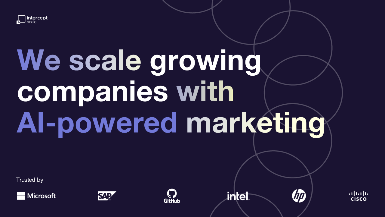
Scale was intended as the bold and boundary-defying counterpart to the Intercept brand, bringing vibrancy, dynamism, and memorability. The original brand direction for Scale felt dull and outdated, and when the project landed in my hands, the design required a full rework to align with the intended vision.

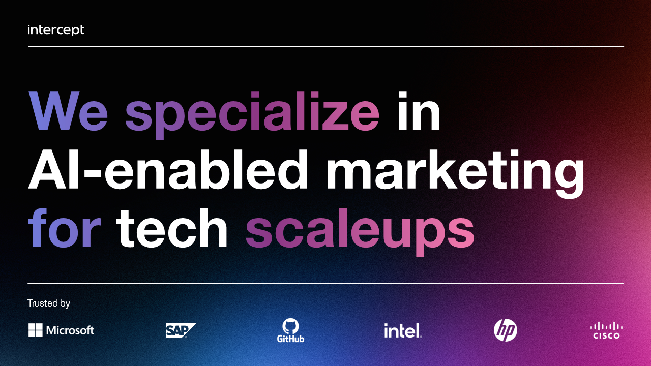
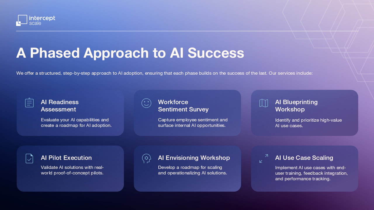
Above are examples of the previous brand identity. It leaned on the tired tropes of innovation by using the “space gradients”. While functional, the result felt derivative and uninspiring.
Approach
I took ownership of revitalizing the brand and building the web experience from scratch:
Brand refresh: Retained the original color palette and visual components but transformed them into a striking, modern aesthetic that aligned with Scale’s rebellious positioning.
Webflow development: Learned Webflow to build the website, solving complex technical challenges without direct mentorship.
Shaping vision into reality: Spearheaded the design and technical execution, shaping the brand and landing page from a rough starting point into a cohesive, compelling experience.
Ownership and problem solving: Navigated incomplete assets, unclear guidance, as well as time and technical constraints to produce a coherent, compelling digital experience.


Design Rationale
The redesign of Scale solved both aesthetic and functional challenges. By refining typography, color, and layout, the brand now feels energetic, cohesive, and intentional.
Dull to memorable: Transformed a flat, uninspiring brand system into something with presence by amplifying muted elements through bold hierarchy, strong scale, and color contrast.
Cohesion builds trust: Unified the landing page and supporting assets with a consistent visual system that communicates with clarity and confidence.
Voice within constraints: Even while limited to Helvetica, I combined hierarchy, weight, and gradient treatments with the brand’s hero graphics to create a distinctive, memorable typographic voice.
Emotional impact: Created a more energetic and contemporary identity that shifts perception from “safe and forgettable” to bold and compelling.
Impact
The rebrand established a clear, cohesive visual identity that elevates the campaign and sets the tone for future work.
Reimagined Scale’s identity with a bold voice. I took a muted, uninspiring brand elements and transformed them through vibrant color, dynamic layouts, and cohesive visual language, creating a compelling and memorable brand presence.
Established a bold, scalable visual framework by refining the brand’s color palette, typography, and visual hierarchy to reflect its intended personality, while designing a flexible, extendable system to maintain consistency across future campaigns.
Took ownership and rescued a failing project, turning it into a showcase of independent, creative, and technical skill.
Why it Matters
💡
Why it Matters 💡
This project exemplified my ability to:
Transform a flawed, underwhelming brand into a memorable, high-impact identity.
Take initiative to learn new tools and technologies on the fly.
Solve complex design and technical challenges independently.
Maintain a professional, high-quality output even under difficult team and project circumstances.